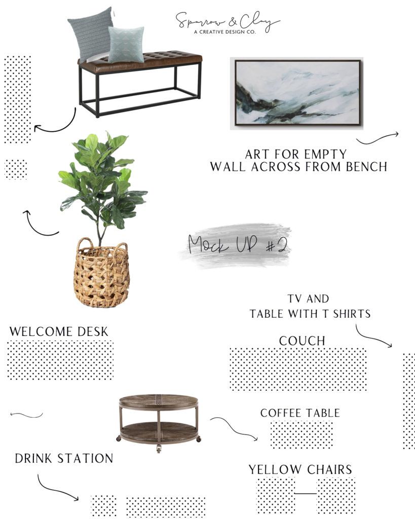
What a blog post title, huh?! Ha! I’ve had a realization lately that design decisions that seem obvious to me can be complicated for someone else! Because of the simple way our brains are wired! So I thought I would show an example of a project I’m working on currently. The client specifically requested two different “mock ups” of where the best placement would be for the furniture in the room! By simply moving a couple pieces of furniture and supplementing where I felt we needed to add some depth and texture!
The pieces that are currently in the office are bright and happy colors, so to make this space a little less juvenile I sourced some moody navies and neutral grays. Every space needs plants! I prefer live, but when its a corporate setting and nobody wants to baby a plant (ha!) a good faux is the way to go!
Below is the second mock up option I presented to the client. We went with the first, and I’m so glad! I’ll show a reveal of the space when we complete it! Can’t wait!
